Chocolates and roses? For us at EverTrue, we’ll take happy donors and satisfied customers! We’re lucky enough to see the awe-inspiring reports, statements, and positive impact philanthropy plays at the many institutions that use ODDER. During this season of love, we thought of no better way to celebrate than by sharing examples of what put hearts in our eyes (and why!).
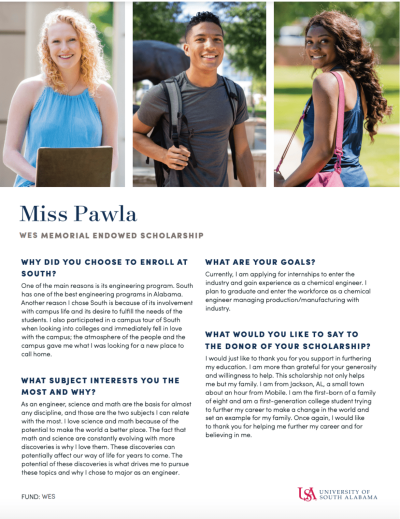
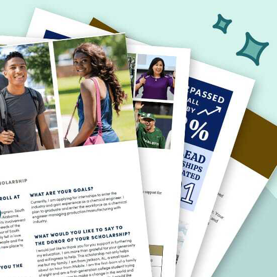
Student Spotlight ODDER isn’t only for endowment reports. There are many, many uses beyond sharing financial information with donors. Just look at our friends at the University of South Alabama, who use it to send annual student impact statements from scholarship recipients.
Putting impact at the heart of their reports, donors receive photos, essays, and updates from students who benefit first-hand from their generosity. This usage is a smart way of utilizing personal touches within your donor stewardship. And we’re not the only ones who love it. This year’s report had an 81% open rate and a 60% click-through rate.
Financials Made Easy
We get it, data can be confusing, and choosing the best way to showcase your financials can be a tricky one. Consider taking a cue from the University of North Carolina Charlotte, which used a clean design with imagery and simple, easy-to-read text.
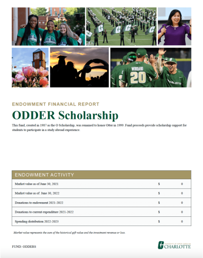
Knowing the average viewer skims nearly 80% of every new page they see, limiting your text makes sure the most important information is at the center. Keeping it simple is often also keeping it effective.
Picture This
Your ODDER landing page is one of the first visuals a recipient sees, and having an eye-catching photo can make or break their engagement. While campus and landscape shots are reliable options, try using one featuring students as Georiga State University did.
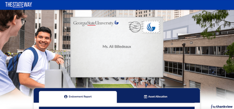
What did you notice first? The smiling students immediately grab your attention and bring you into the video and other content. People form a first impression in a mere 50 milliseconds. Choosing a photo that best represents your institution, including those who call it home, helps capture your audience’s attention.
Lights, Camera, Action!
An estimated 3.37 billion internet users consumed video content in 2022, so what made yours stand out from the rest? For the University of Guelph, it was their personalized content.
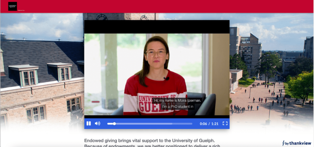
Rather than using one video for every donor, Guelph personalized the thank you based on a donor’s giving experience. For example, donors who supported scholarships were thanked by a student scholarship recipient, those who gave to research funding were thanked by a graduate student directly impacted by their gift, and so on. They also smartly utilized captions, as research suggests anywhere from 60-80% of online content is viewed without sound.
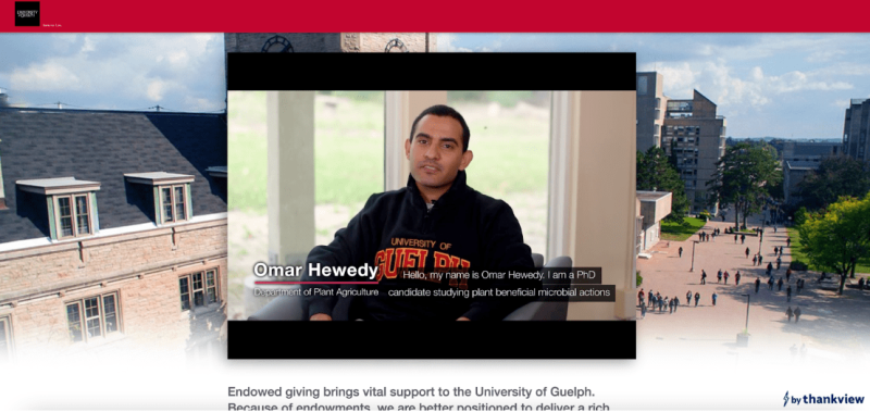
These smart choices led to incredible results: over 70% of recipients began watching the video with nearly 50% completing it. These examples are but a mere few that we loved. In fact, ODDER reports yield significantly higher open rates than industry standards, telling us that donors also love them.
Whether you’re an ODDER veteran or just starting on your digital journey, these tips are sure to put your audience in a loving mood!
